
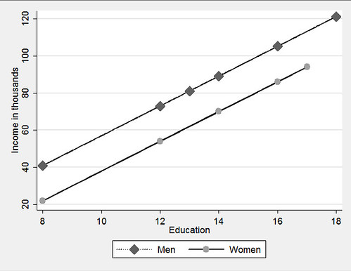
Option 1:
regress inc educ male, beta
predict incfnoi if male==0
predict incmnoi if male==1
twoway (connected incmnoi educ if male==1, lcolor(black) ///
lpattern(dot) msymbol(diamond) msize(large)) ///
(connected incfno educ if male ==0, lcolor(black) ///
lpattern(solid) msymbol(circle) msize(large)), ///
ytitle(Income in thousands) xtitle(Education) ///
legend(order(1 "Men" 2 "Women")) scheme(s2manual)
This code snippet is from A gentle introduction to Stata. The results are presented above.
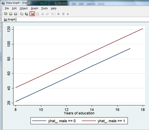
Option 2:
Install the two packages first:
net describe postgr3, from(http://www.ats.ucla.edu/stat/stata/ado/analysis)
net install postgr3.pkg
net describe xi3, from(http://www.ats.ucla.edu/stat/stata/ado/analysis)
net install xi3.pkg
followed by the code:
xi3: regress inc educ male, beta
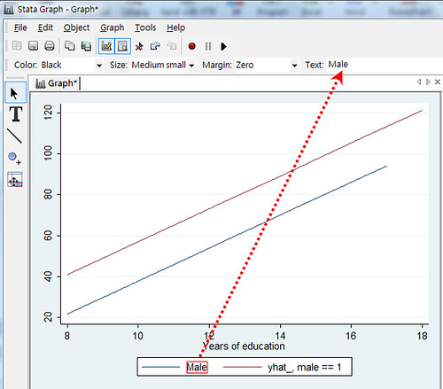
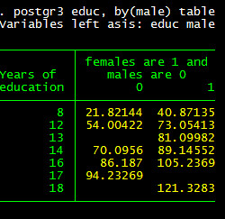
postgr3 educ, by(male) tableJust two lines, isn’t that cool? Umm? Do you notice anything wrong? If you don’t like footnotes, such as yhat_, male==0, you can click the highlighted part below and make some changes.
Select the area you wish to change, and change it in the area indicated by the red arrow.
This also provides a table with which to ensure everything is correct.
You can get more information on the UCLA website here: http://www.ats.ucla.edu/stat/stata/ado/analysis/postgr3.htm
You can also use predxcat and predxcon, with the command findit to get these two packages. I think that options 1 and 2 are adequate. Option 2 also allows you to draw interaction easily. I’ll talk about this in my next post.


Comments
No response to “Stata: Drawing regression lines across groups” Post Comments (Atom)
Post a Comment |
Post a Comment